Beacon Design System
Overview
While on the application team at Lifion, I became an anomaly because I was the first UX designer to develop a strong understanding of how to build pages on Lifion’s Builder. I became fascinated with the way the components were built and designed, eventually I transitioned from the application side to join the UX platform team, and one of the biggest projects I worked on, was designing for Lifion’s new design system called “Beacon.” This was a very fun project to work on because not only were we improving our existing components, but also defining a new way forward with the platform developers. Traditionally, the UX platform team would deliver wireframes completely red lined with annotations, we learned to take care of these monotonous and time consuming tasks directly on “Beacon”. The process became quick and proficient, it involved the UX designers prototyping our designs directly in code.
The final delivery for the platform developers consisted of coded files ready for copy and paste. The design portion was all completed by the time they received the files, this new process saved rounds of design edits and allowed them to focus on complex backend development.
My Roles
UI Design
Developer
What We Did
This became the norm when designing a new component or enhancing UI or functionality for an existing one:
• Design all visual and functional states in Sketch
• Prototype in HTML/CSS (UX had its own repo using design tokens that mirrored the platform devs repo)
• Peer review of HTML/CSS to ensure correct usage of tokens
• Deliver final files to platform developers
• Work with solution architects implementing the components on the Builder
Component Designs
Below are some of the components the UX platform team (4 of us total) designed, developed and assisted implementing into the Builder. The final delivery took about 8 months and it consisted of about 20 components that had to be re-done.
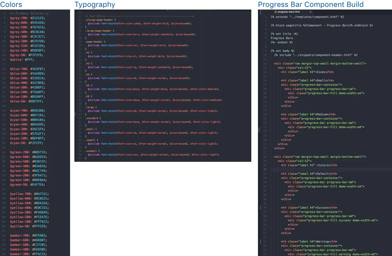
Coding and using design tokens
There were a lot of challenges with the implementation of this new process. Coding the designs made this possible, in order to do this correctly we had to ensure consistency across the teams with naming conventions. We created our own repo to make the process simpler, we used the same naming conventions in the HTML and CSS properties called “Design Tokens” that the developers used in their repo.
Outcome
Because the platform’s UX team had taken the initiative to design in code, it saved a lot of time on the platform’s developers end. In 8 months we were able to turn over 20 components and continued to design and build more.


