
Component Enhancement:
Table “Button Pocket” Feature
Overview
At Lifion, applications are built using its own builder which is a sophisticated drag and drop tool supported by a series of micro services. This is achieved by two teams: the platform team and the application team. The platform team maintains and iterates the builder so that the application teams (scrum) can build their products on. In turn, the application teams supplies requirements for new features, enhancements to existing components and bug issues to the platform team.

While on the application side, one of the biggest issues from the application developers was the inability to replicate wireframe designs due to component constraints on the builder. I experienced this issue from the devs on my own scrum team and no matter how simple I made the wireframes, I kept hearing the same pain points. Without anyone asking me, I took it upon myself to jump on the platform and become the first UX designer to build on the platform. Eventually my skills working on the builder advanced to the point that application developers were coming to me with their build obstacles, so I transitioned to the platform’s UX team to improve existing component functionality.
One of the most impactful enhancements I contributed to was to the table component’s feature called the “button pocket.” This feature was giving the application developers a lot of grievances during “design time” and because I had a good understanding of of how they were using this and other components, I was tasked with figuring out a way to enhance it.
My roles
User Experience
Solution Architect
UX Research
The problem
During “design time”, the button pocket is an area just above the table’s column headers reserved for table actions for the application developer to input buttons into. The problem was that this area is ONLY reserved for button components and would not allow any other component inside it. This conflicted with UX display standards using tables because in most situations, that axis where the buttons are displayed is also shared with filter components.
Below is an example of a wireframe that an application developer would receive from a UX Designer. Above the table’s column header, displays filters and buttons.
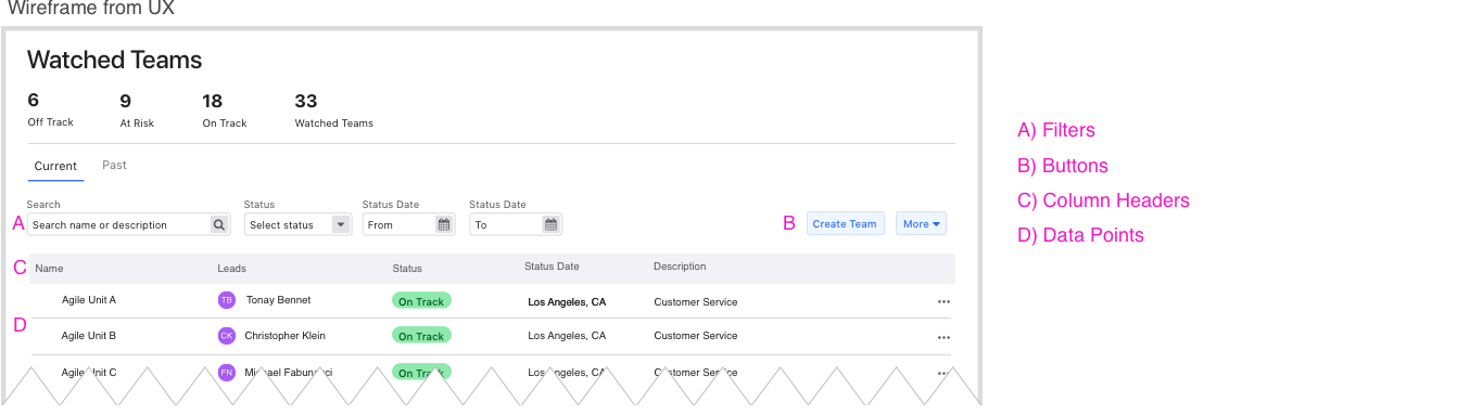
Below is the table component that the application developer views during “design time.” The dotted pink line is the table component’s “button pocket” which is reserved ONLY for button components. In the wireframe above, the buttons share the same axis as the filters which creates a build issue.

During run time, this is how it would look: Two rows, one for filters and below it, one for the buttons creating an awkward space which goes against UX patterns displaying tables.

What I did
First iteration and testing: Split button pocket row 50%: One column for filters, one for buttons
Because it was common practice to place filters on the left and buttons on the right, my first approach was to split the button pocket row 50/50. One column for filters (left), the other for buttons (right). After conducting several test sessions with application developers, they were into the idea of the button pocket area being open to allow filters, however, they raised concerns of the two column being absolutely scaled to 50% on each side. Several people asked, “what if the amount of filters they had was more that can fit in the column space allotted and only one button in the other column? It’s a waste of reserved real estate.”

Second iteration and testing: Allow application developers to customize The button pocket’s row column count
After hearing what the application developers had to say in the first round of testing, I decided to go with a flexible approach that would enable the application developers to set the button pocket’s column count. Think of when a developer has a wireframe where the page has, for example, a 9,3 layout, the code would look something like this:
<div class="row">
<div class="col s1">9</div>
<div class="col s1">3</div>
</div>
This same idea could be applied to the button pocket by allowing the application developer to manually set the width each column. In order to achieve, a new property would have to be added to the table’s component which would allow the application developers to input number of columns.

Outcome
I brought my results from the testing to the solution architect and lead developer. In the first sprint, the platform developers did a “spike” testing the idea which proved to be positive and the remainder was built in the following sprint. Upon release in the platform demo, it received a lot of praise from the application developers.